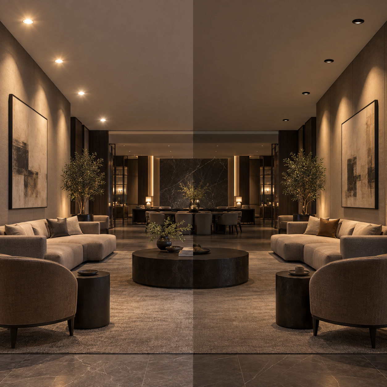
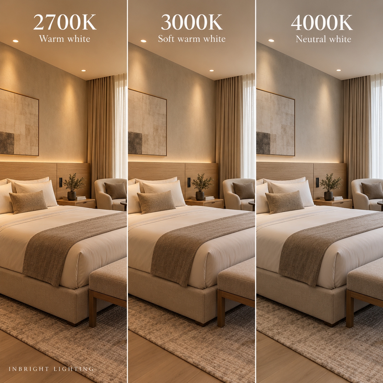
The same room can feel intimate, welcoming or crisp depending on the colour appearance of its light. For LED downlights, 2700K, 3000K and 4000K are three common choices. Each can work well, but the right one depends on the room’s purpose, materials and relationship to nearby spaces.
This guide compares their visual effects and offers a practical way to select colour temperature for hospitality, residential and commercial projects.
Correlated colour temperature, or CCT, describes the colour appearance of a white light source and is expressed in kelvin (K). At these three settings, a lower number generally looks warmer and more yellow, while a higher number looks more neutral or cool.
CCT does not tell you how bright a downlight is or how accurately it renders objects’ colours. Check lumens and the lighting layout for brightness; review colour-rendering data separately when fabrics, food, artwork or merchandise matter.
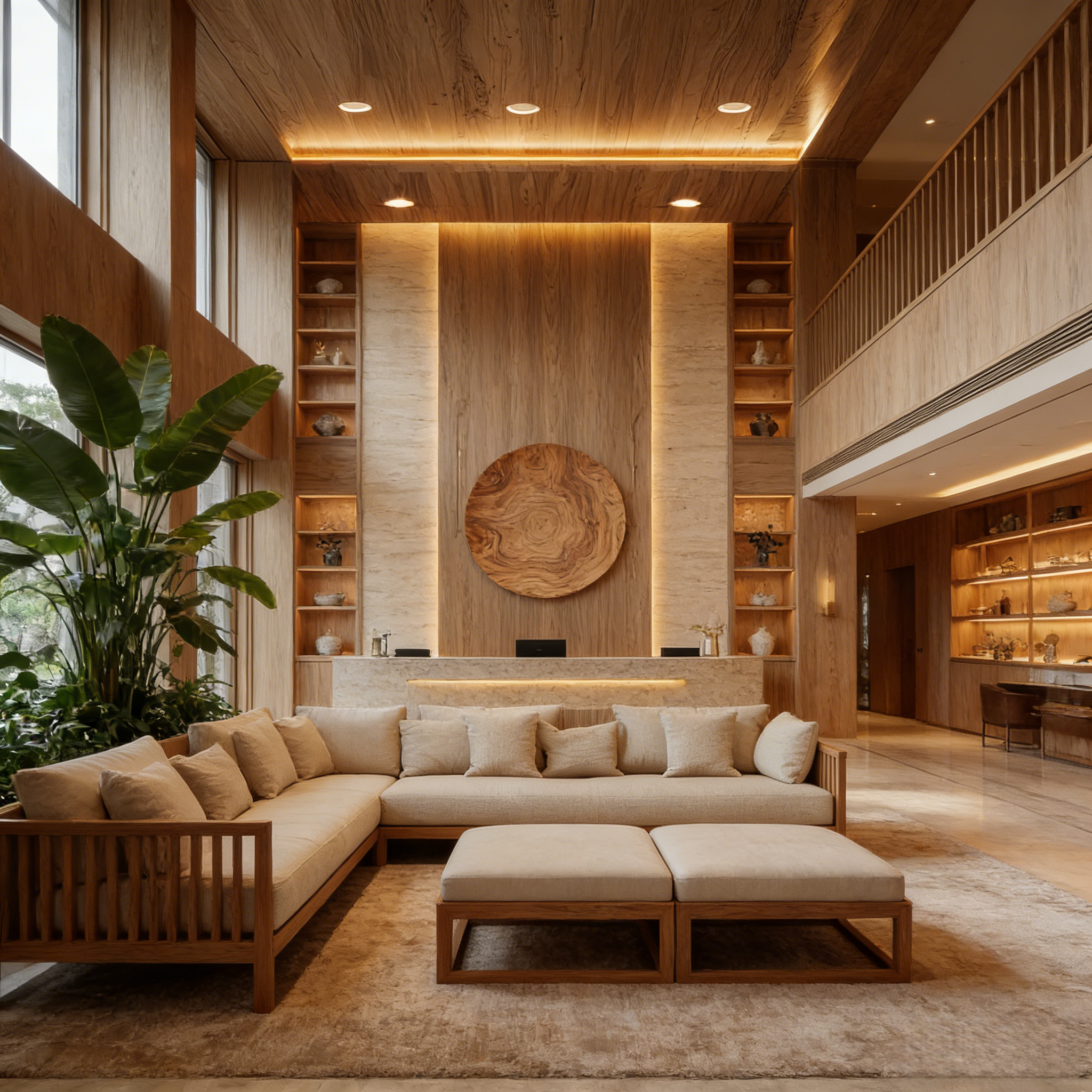
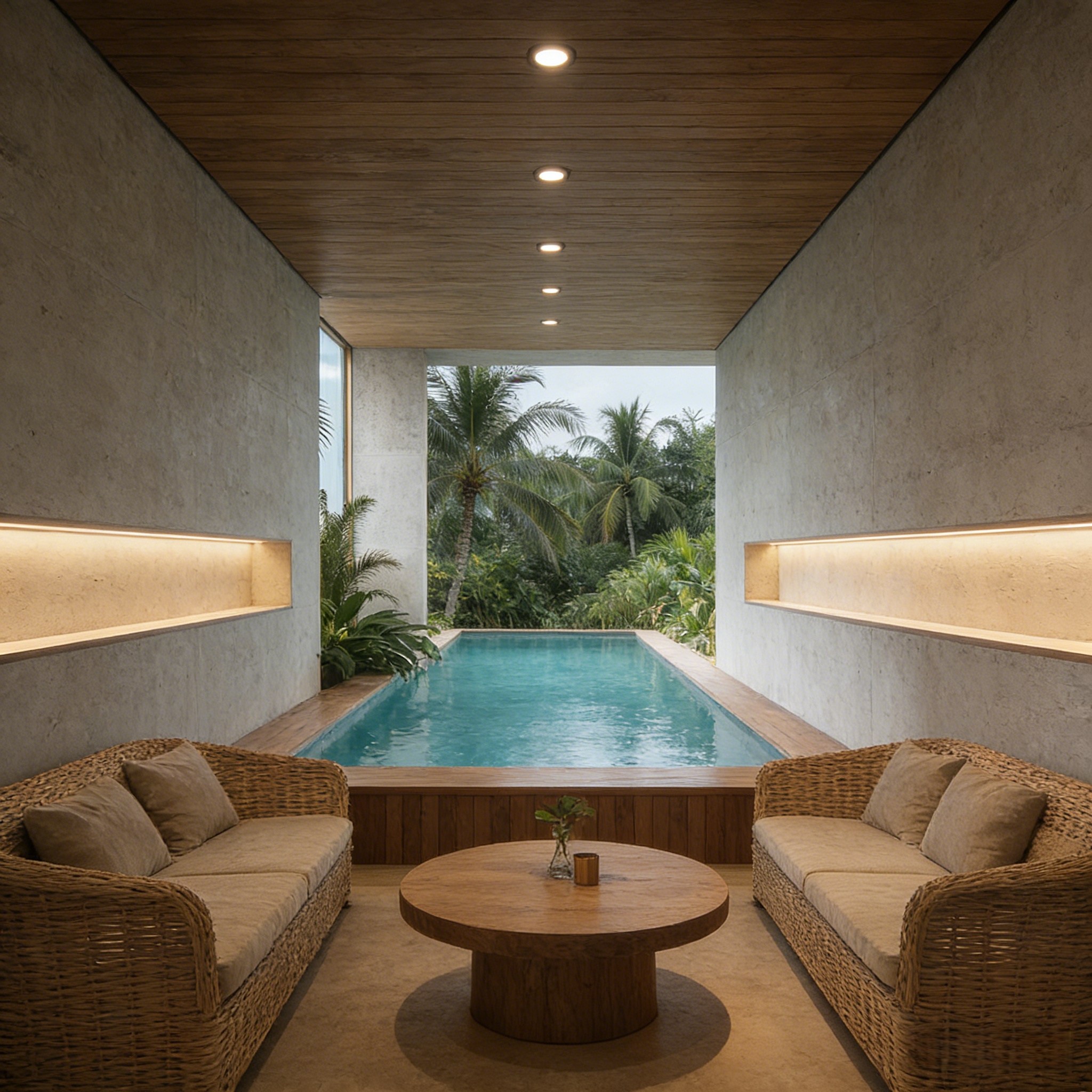
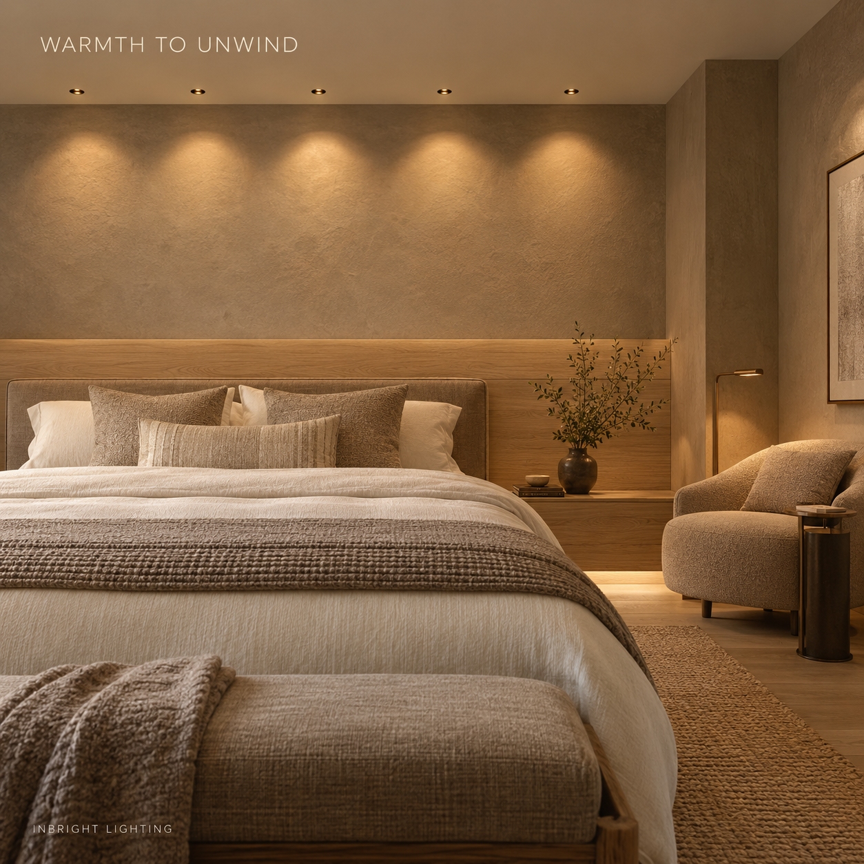
2700K creates a distinctly warm appearance. It can support an intimate atmosphere in hotel guest rooms, residential bedrooms, lounges and restaurants.
It often pairs well with timber, warm stone and soft furnishings. In a project with several light sources, compare the downlights with bedside lamps, decorative fixtures and indirect lighting. Even when each source is described as “warm white,” visible differences may appear when they are used together.
Choose 2700K when a relaxed atmosphere is a design priority. Check a sample against the actual finishes before specifying it throughout the project.
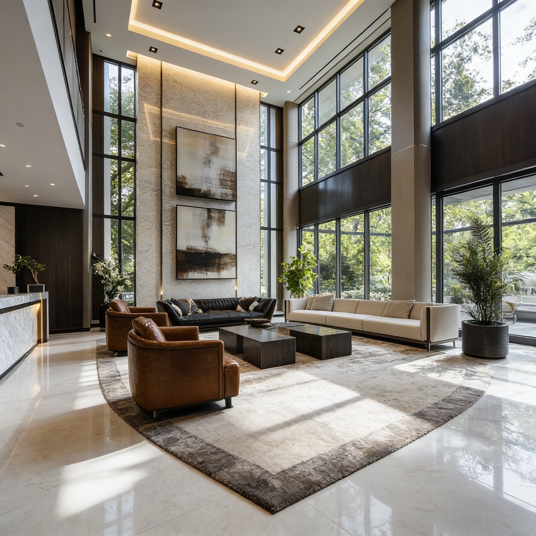
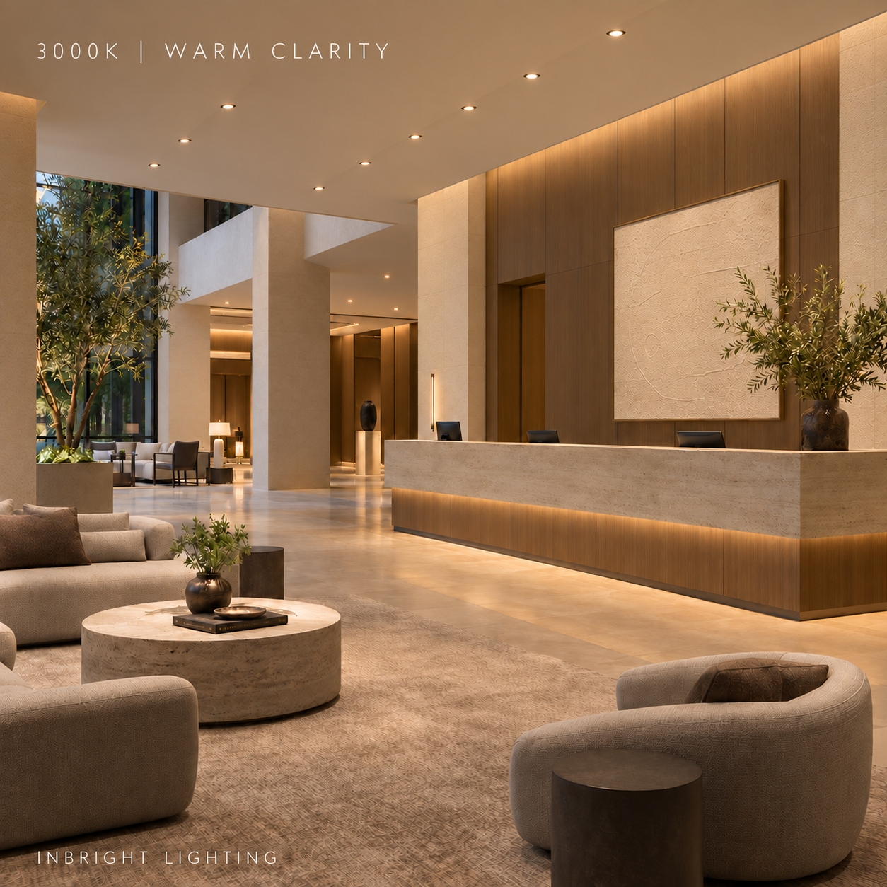
3000K still reads as warm white, but usually appears less golden than 2700K. It is a versatile starting point for hotel lobbies, guest rooms, restaurants, residential living areas and selected retail spaces.
It can provide a comfortable atmosphere while giving the space a slightly cleaner visual character. For properties that want a consistent appearance across many guest-facing areas, 3000K may be practical, though fixture type, output and surrounding materials will still affect the result.
Choose 3000K when you want warmth without making it the dominant visual feature.
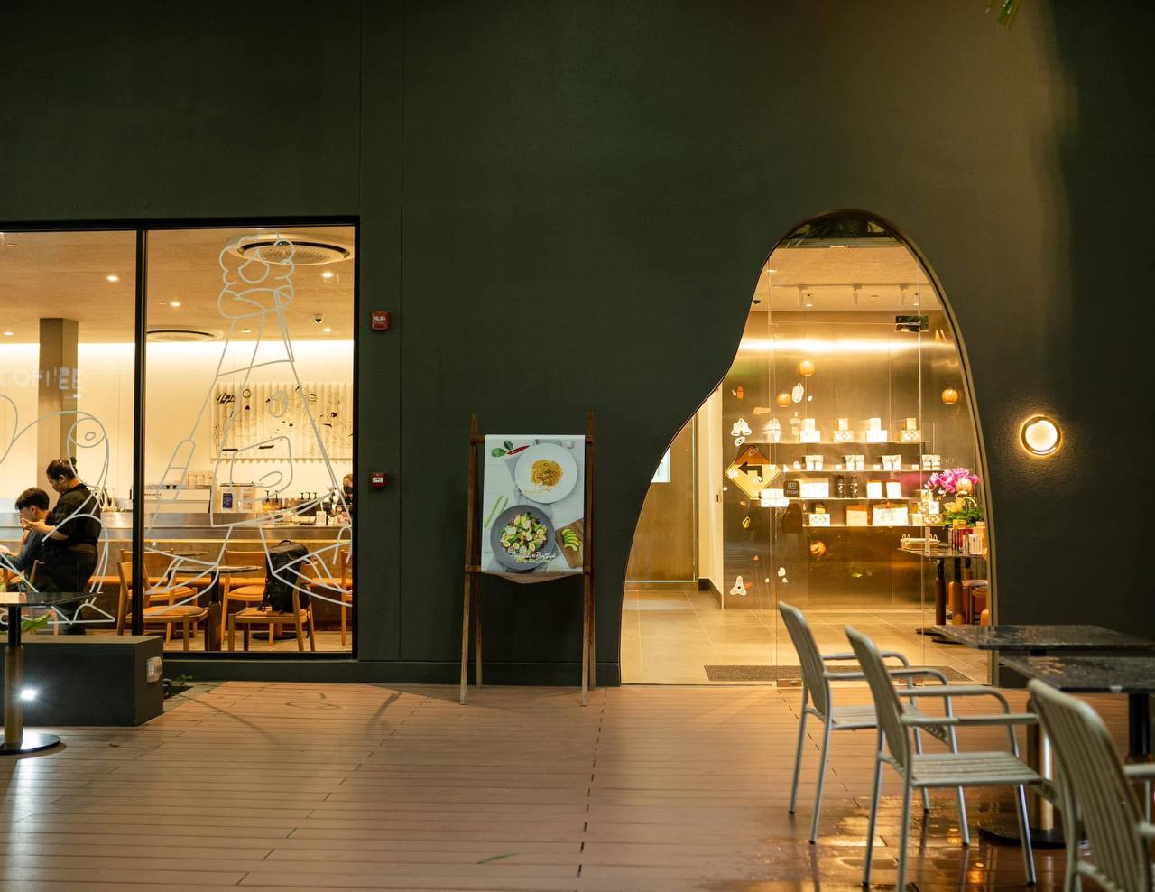
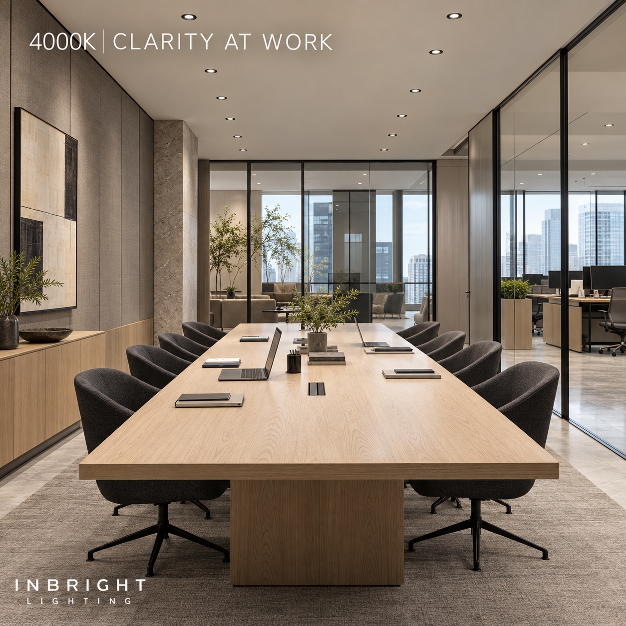
4000K has a more neutral white appearance. It may suit offices, meeting areas, work zones, some retail environments and service spaces where a clearer, less warm visual impression is desired.
A 4000K downlight does not automatically provide more light than a 3000K model. Compare the actual lumens, beam distribution and illuminance on the task surface. Also consider how the space connects to adjacent rooms: a sudden change from a warm hotel lounge to a neutral-white corridor may feel abrupt if both areas are visible together.
Choose 4000K when the intended atmosphere and visual task call for a neutral appearance.
| Colour temperature | General appearance | Potential applications |
|---|---|---|
| 2700K | Noticeably warm | Guest rooms, bedrooms, lounges, intimate dining |
| 3000K | Warm white | Hotel public areas, residential living spaces, restaurants, retail |
| 4000K | Neutral white | Offices, meeting areas, work zones, selected service spaces |
These are design starting points, not fixed rules. A restaurant may choose 3000K; a residential workspace may choose 4000K. The best option is the one that supports the activities and finishes in that particular space.
Look at the materials. Test the proposed light against wood, stone, paint, textiles and merchandise. A sample seen on a desk may look different when installed in the actual ceiling.
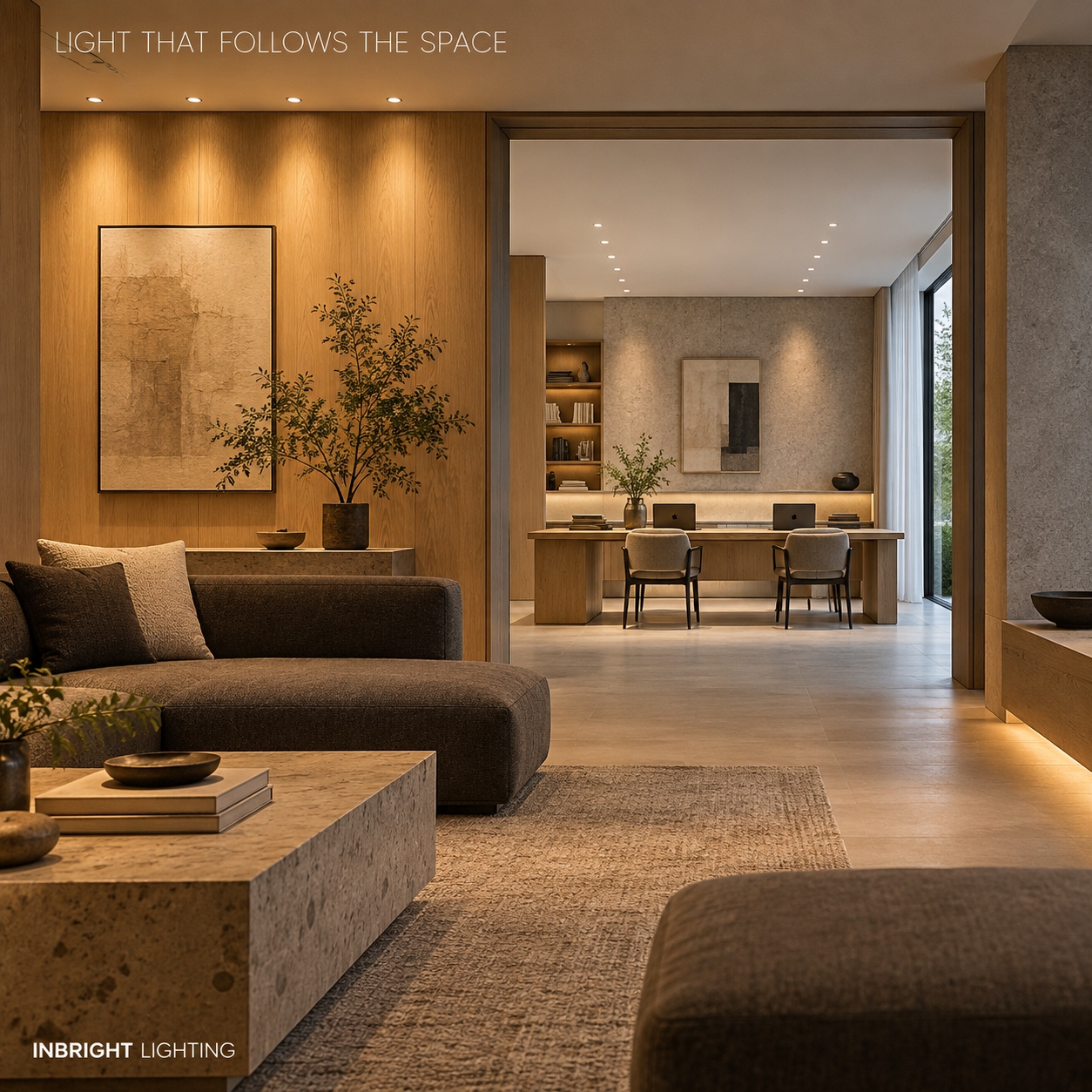
Consider neighbouring spaces. Decide whether connected rooms should share one colour appearance or change gradually. Pay particular attention to long sightlines across a lobby, restaurant and corridor.
Check the light level. Colour appearance and illuminance interact in the overall impression of a room. Review the proposed CCT at the brightness people will actually use, including dimmed settings.
Specify consistency. Ask for colour-consistency information for the exact fixtures. A row of downlights with visibly different white tones can distract from an otherwise orderly ceiling.
Test the complete system. If the project uses tunable white or dim-to-warm lighting, confirm how colour temperature changes with the controls. A standard dimmable downlight does not necessarily become warmer when dimmed; dim-to-warm is a specific behaviour.
Yes, when the change serves a clear purpose. A hotel could use warmer light in guest rooms and a more neutral appearance in a work area. Keep the transition deliberate, especially where two spaces can be seen at once.
Avoid choosing a different CCT for every zone without reviewing the combined view. If a project calls for several settings, compare physical samples under the same viewing conditions and record the selected CCT for each fixture type in the lighting schedule.
Start with the experience you want the space to create. 2700K suits a strongly warm, relaxed atmosphere; 3000K offers a flexible warm-white option; 4000K supports a more neutral appearance. Then confirm the choice with the real interior materials, the planned light levels and a sample of the exact downlight.
Colour temperature sets the tone of the light. Beam angle, output, glare control and colour rendering determine whether the complete installation works well.
Building 2, No.442, Wuyi Road, Jianghai District, Jiangmen City, Guangdong, China.
admin@inbright-lighting.com
0086 - 13424998756
Copyright © Jiangmen Inbright Lighting Co., Ltd All Rights Reserved. 粤ICP备2025393167号 Sitemap XML