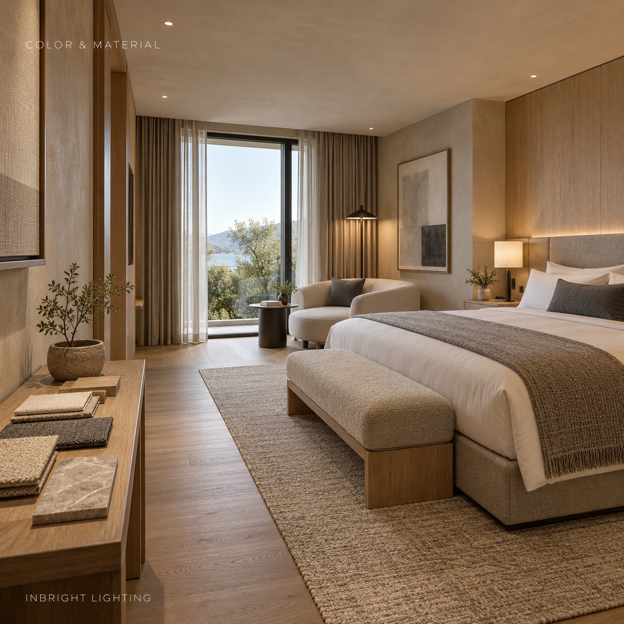
Colour rendering affects how people see materials, merchandise, food and faces under artificial light. When selecting LED downlights, project teams often encounter three options: CRI 80, CRI 90 and CRI 97. A higher number suggests better average colour fidelity, but the highest available CRI is not automatically the best specification for every space.
The right choice depends on what people need to see accurately, the project’s budget and the performance of the exact fixture being supplied.
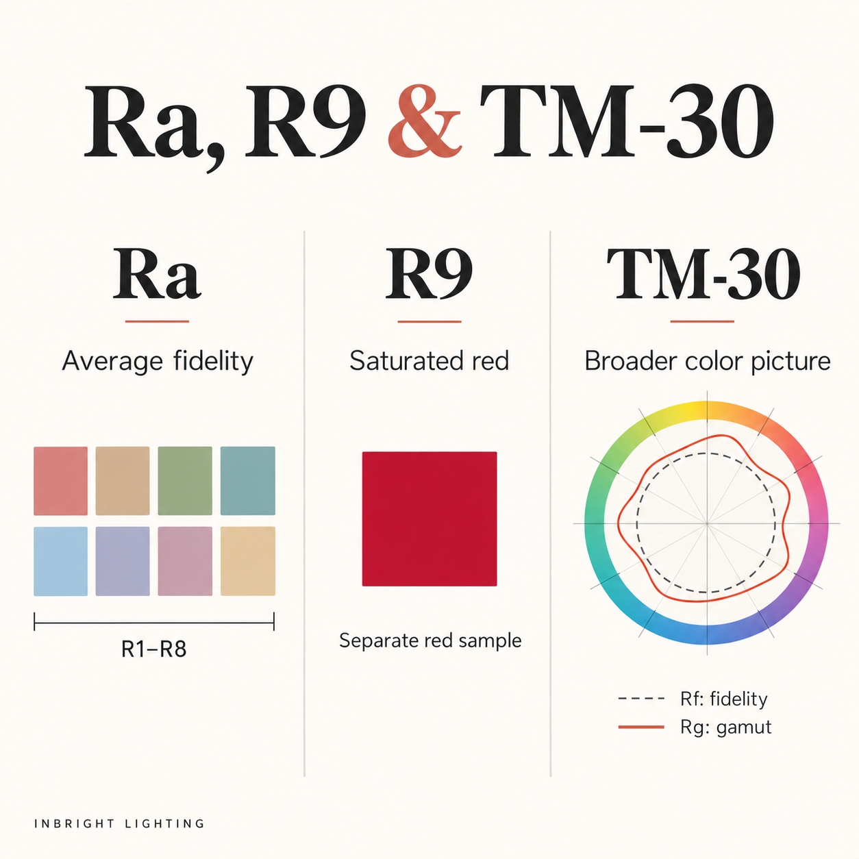
CRI, also called Ra, compares how a light source renders a set of test colours against a reference source at a similar colour temperature. The general Ra value is calculated from eight test colour samples. It provides a useful starting point, but it does not describe every colour equally well.
That limitation matters when a project depends on particular colours. Saturated red, for example, is assessed separately as R9 and is not included in the eight-sample Ra average. Two downlights with the same CRI can therefore make red materials, food or skin tones look different.
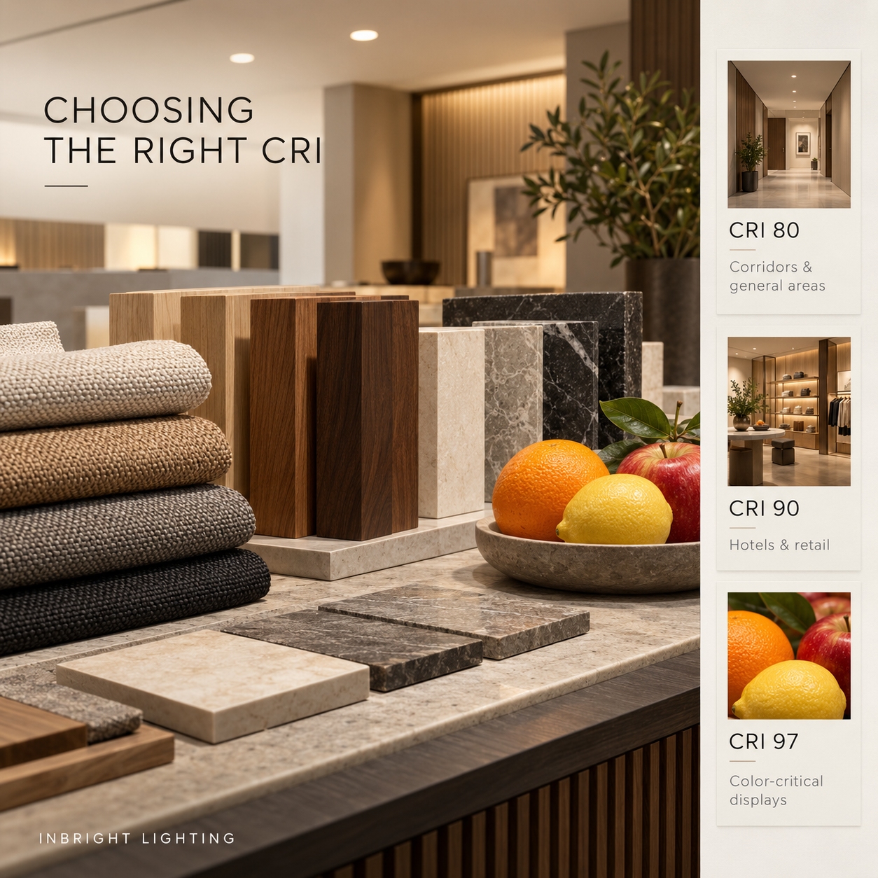
CRI 80 can be a sensible choice where the main task is visibility and colour judgment is not especially demanding. Examples may include circulation routes, storage areas, back-of-house spaces and some general lighting applications.
This does not mean every CRI 80 downlight looks the same. Colour temperature, spectral distribution and consistency between fixtures also affect the result. Review samples where adjacent spaces use different products, especially if guests or customers can see both areas at once.
Choose CRI 80 when: the project requirements permit it, the visual task is straightforward and the exact fixture meets the required lighting performance.
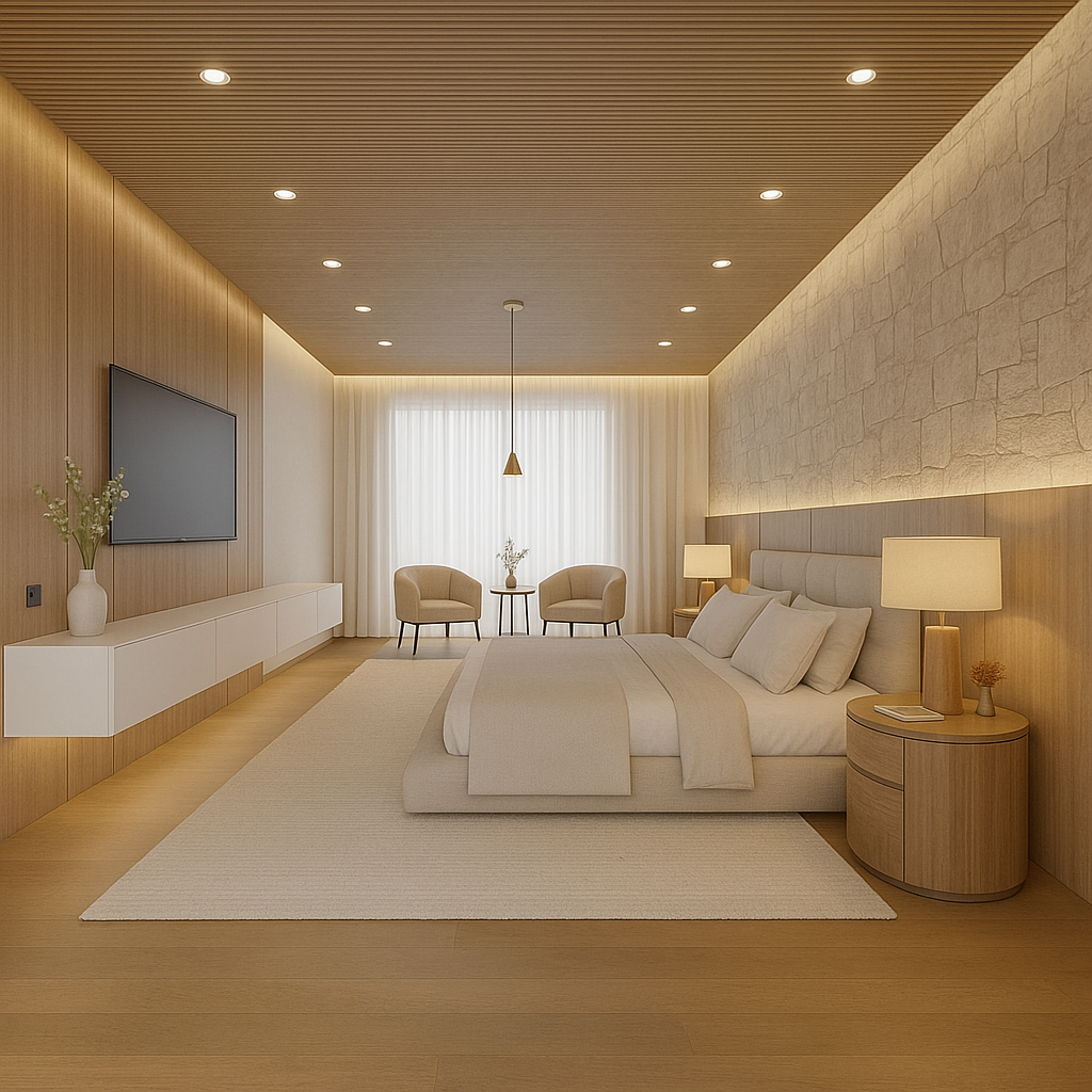
CRI 90 is often a useful starting specification where finishes, products and people are central to the experience. Hotel guest rooms and lobbies, restaurants, residential interiors and many retail spaces may benefit from closer attention to colour appearance.
It is still important to check more than the Ra value. In a restaurant, examine food and table finishes under a sample. In a hotel, compare fabrics, wood, stone and skin tones at the intended colour temperature and dimming levels. A CRI 90 label alone cannot confirm that every material will appear as expected.
Choose CRI 90 when: colour appearance has a clear role in the design and you need a practical specification for a broad range of occupied spaces.
CRI 97 indicates a very high general colour fidelity rating. It may be appropriate where close colour comparison is part of the activity: selected galleries, premium merchandise displays, material review areas or spaces with a particularly demanding visual brief.
Specify it for a reason rather than applying it across an entire building by default. Ask whether the higher CRI produces a visible benefit for the actual objects and finishes. Also verify the quoted model’s light output, efficacy, beam options, colour temperature and cost; these may vary between CRI configurations.
Choose CRI 97 when: the project has a defined need for very high colour fidelity and the exact product has been assessed against the materials it will illuminate.
| CRI option | Potential project fit | What to verify |
|---|---|---|
| CRI 80 | Circulation, service and general-use areas where permitted by the brief | Required light levels, colour consistency and local project requirements |
| CRI 90 | Guest-facing hospitality, residential, dining and many retail areas | Appearance of people, food and finishes; R9 where relevant |
| CRI 97 | Selected displays and colour-critical tasks | Measurable or visible benefit, exact fixture performance and cost |
These are selection starting points, not universal minimum requirements. Follow the project specification and any applicable local requirements.
Check red rendering. If skin tones, red fabrics, artwork or food matter, request the R9 value alongside Ra.
Compare colour temperature. A warm-white and a neutral-white source can both have CRI 90 yet create different atmospheres. Compare products at the intended colour temperature.
Review colour consistency. In a row of downlights, visible differences between fixtures may be more distracting than a small difference in their stated CRI values.
Consider TM-30 data for demanding projects. TM-30 provides several measures and graphics for examining colour rendition beyond a single average score, including fidelity and gamut information. It can help project teams compare products more thoroughly when colour appearance is a major design concern.
Test the complete fixture. Request data for the exact LED module, driver, optics and colour temperature quoted. Review a sample in the intended space, with the real materials and at the light levels people will use.
A hotel might specify one colour-rendering level for service corridors and a higher level for guest rooms, dining areas and the lobby. A retail project might use general lighting across circulation areas, then assess higher-fidelity options where customers compare fabrics, cosmetics or other colour-sensitive products.
The aim is a consistent experience within each visible space. If different CRI options are used across a project, compare their colour temperature and appearance together before ordering in volume.
Start with CRI 80 for straightforward general lighting where the project brief allows it. Consider CRI 90 for spaces where people, food, finishes and merchandise should look natural. Reserve CRI 97 for clearly defined colour-critical needs, subject to sample review.
For any of these choices, ask for the exact product’s Ra, R9 and, when useful, TM-30 data. The best specification is the one that makes the project’s real materials look right while meeting its lighting, installation and commercial requirements.
Building 2, No.442, Wuyi Road, Jianghai District, Jiangmen City, Guangdong, China.
admin@inbright-lighting.com
0086 - 13424998756
Copyright © Jiangmen Inbright Lighting Co., Ltd All Rights Reserved. 粤ICP备2025393167号 Sitemap XML